It is pretty rare I get to do design or concept work as my main focus tends to be UX and Front End Development. It was so much fun to get involved with this month's design challenge in .NET Magazine. The brief was a fictional environmental charity and I enjoyed every minute of it, especially designing the logo!
A Drop in the Ocean #
ADITO is a call to action to the world to try and stop the destruction of the world’s oceans. This has been especially highlighted recently after Planet Earth 2 and the increasing focus on plastic waste and the effects on wildlife and our coastlines. Costs for a charity of this nature are paramount as it is a type of charity that often struggles for real investment. As such minimising ongoing costs is a priority.

The site runs on a JAMStack (Javascript, API and Markup) meaning there are no real charges to speak of as it is hosted via Github pages. The main focus of the site is awareness, events, data capture via a newsletter signup and of course a call for donations. It goes without saying that the site is device agnostic and is focusing on getting the message across.
It was decided that photos of stricken animals, whilst shocking are not as likely to engage, instead illustrations and facts which show the size of the problem combined with some subtle css animation would be both cost effective and engaging.

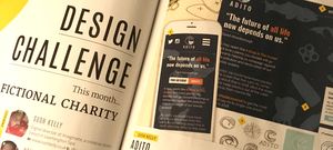
Close Up #
1 - Everything starts with a pencil! As tempting as it can be to jump into Sketch or Photoshop a paper and pencil allows you freedom to develop your initial idea.
2 - Donate/Event Switcher the two main actions are a tabbed module, the admin can set to be in event or donate mode during the marketing cycle. The donate panel has quick choices for the donation amount to encourage a spur of the moment donation.
3 - Illustrated SVG Animation - Illustration can be as impactful as photographs without being as shocking, they can also be animated easily and cost effectively. Particles animate on scroll independently from the animals and rubbish to give a feeling of movement.
4 - Device specific layout - using flexbox and grid allows us to change layout on different devices with media queries, in this case swapping the stack order to allow the logo to sit in the middle on mobile.
5 - Microinteractions can give real depth to a simple design. In this case the navigation items rotate slightly on hover to imitate floating on the water's surface.