This tutorial is for people who have heard of css-grid and are interested to see what it can do or perhaps are not sure how to fit it into their workflow. #
It is also interesting if you have learnt your layout skills off the back of frameworks such as Bootstrap. A basic knowledge of css is good, although you should be able to follow along as we are covering how you approach the build of the page more so than creating it.
After completing this tutorial you will be able to approach site builds logically and write clean future proof code rather than using hacks. This tutorial does not cover html/css skills generally but is focused on how you would structure your build and the grid styles used to lay it out. I have not covered fall back styles for browsers that do not support grid so as not to distract from the focus of the tutorial.
You can follow along using this Codepen for reference: #
https://codepen.io/maxray/pen/eYYXNQb
The problem #
The life of the front-end developer is never boring. Depending on the processes at your place of work you may be involved in the development of a design - or perhaps you get given mobile and desktop comps to build from. You may even just get given a desktop mockup and have to work the rest out for yourself.
How you build sites may also be affected by how you learned to write html/css. If you are lucky enough to have started building websites after the time when floats and clears were used there is a good chance you have started off using some sort of framework such as Bootstrap.
At the agency I freelance for there is an agreement to use the bootstrap grid as a base on builds. It has support from the majority of the developers and means that there is a development standard for people to work to which (even though I am not a fan of Bootstrap personally) is a good thing.
On a recent project though the design was hard to build using this framework and the developers were getting frustrated as it felt they were having to write more and more hacks. The design process had resulted in a different flow of content on mobile which again created issues.
The Law of the Instrument #
Frameworks dictate the structure of your html. Wrapper divs and nested columns all allow the easy creation of strict grid layouts. It is easy though to form a reliance on a specific tool and at which point a cognitive bias called ‘The Law of the Hammer’ can cause you to try and use the tooling you know for every eventuality.
"I suppose it is tempting, if the only tool you have is a hammer, to treat everything as if it were a nail." - Abraham Maslow
If you have direction from a designer that breaks this mould and direction from your framework you are left in the middle, trying to force a round peg into a square hole. This does not make for a happy developer, it can feel that you are not pleasing everyone, even yourself as you add in rules to force the layout into shape resulting in technical debt, lots of extra styling and compromises with the design team.
I rebuilt a section of page using clean minimal html and the use of css-grid to show how this painful process could turn into something they could get excited about and ultimately leave everyone feeling satisfied.
So let’s have a look at the design and work out what to do.
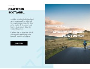
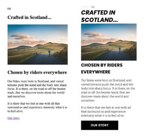
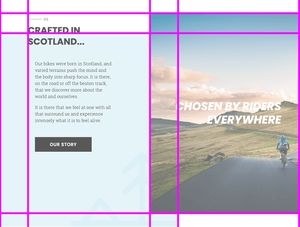
The desktop view #
A 2 column overlay with an image, tree icon and then typography also overlaid. Not insanely complex at first glance, but looks can be deceiving.
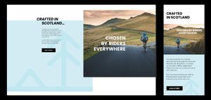
If you were thinking in a Bootstrap way you might think a row and two columns would be great. So let’s see how this would transfer to mobile?
The Mobile View #
Stacked blocks with content fairly simply laid out. One thing we can see is the stacking order is different - this means the 2 column approach is not going to work unless we can pull the titles out and position them elsewhere… what is a dev to do!?
Back to Basics #
The first thing I do when approaching a layout is break down the elements that make up the page. Make sure to pay attention to the stacking order on mobile as this is the logical way to lay the page out and will mean less repositioning of elements. It also means that if for some reason your page loses it’s styles then the html that renders will make sense to the user!
The great thing about CSS Grid is that you don’t need loads of wrapper divs in order to build up your layouts. In fact until subgrid ships to the main browsers lots of container divs are a problem as the grid will only affect it’s direct children.
For this page we have 2 heading titles, a photo, some copy, a link and a decorative tree icon background.
With bootstrap you may end up with something like this:
<div class="c-content-block">
    <div class="row no-gutters flex-column-reverse flex-xl-row">
        <div class="col-12 col-xl-6">
            <div class="c-content-block__text c-content-block__text--blue d-xl-flex justify-content-xl-end">
                <div>
                    <p class="c-section-marker c-section-marker--inline mb-2">04</p>
                    <h2 class="mb-3 h-italic">
                        <span>Crafted in</span>
                        <span class="d-block h-offset">Scotland...</span>
                    </h2>
                    <div class="h-offset h-width-93">
                        <p>Our bikes were born in Scotland, and varied terrains push the mind and the body into sharp focus. It is there, on the road or off the beaten track, that we discover more about the world and ourselves.</p>
                        <p>It is there that we feel at one with all that surround us and experience intensely what it is to feel alive.</p>
                        <a href="" class="c-btn mt-4">Our story</a>
                    </div>
                </div>
            </div>
        </div>
        <div class="col-12 col-xl-6">
            <div class="c-content-block__image d-xl-flex justify-content-start align-items-center">
                <h2 class="h1 h-color-white text-right ml-4 h-zindex-1">Chosen</br>by riders</br>everywhere</h2>
                <img src="https://images.unsplash.com/photo-1471506480208-91b3a4cc78be?ixlib=rb-1.2.1&ixid=eyJhcHBfaWQiOjEyMDd9&auto=format&fit=crop&w=1353&q=80" alt="" />
            </div>
        </div>
    </div>
</div>
But because we are focusing on the elements and using a different approach we can reduce the amount of base html needed:
<section class="grid-section">
  <p class="chapter">04</p>
  <h2 class="h-italic"><span>Crafted in</span> <span>Scotland...</span></h2>
  <img src="https://images.unsplash.com/photo-1471506480208-91b3a4cc78be?ixlib=rb-1.2.1&ixid=eyJhcHBfaWQiOjEyMDd9&auto=format&fit=crop&w=1353&q=80" alt="" />
  <h2 class="h-color-white">Chosen by riders everywhere</h2>
  <div class="text-content">
    <p>Our bikes were born in Scotland, and varied terrains push the mind and the body into sharp focus. It is there, on the road or off the beaten track, that we discover more about the world and ourselves.</p>
    <p>It is there that we feel at one with all that surround us and experience intensely what it is to feel alive.</p>
    <a href="" class="c-btn">Our story</a>
  </div>
  <div class="tree"></div>
</section>
Clean simple code which just on its own gives us an output that makes sense. Adding just the simplest of button and font styles and suddenly things are looking tidy.
So far so good… but this looks nothing like the design I was given, the designer is going to kill me! We will come to that next, but what is good to note here is that you have created a good base to build from. All those people with odd old browsers will be happy you made the effort. :)
If you have got it flaunt it! #
CSS Grid has a 92% coverage currently, it is only really opera mini and IE/old old browsers that won’t support it. In a second tutorial I will look at what we can do for these poor folks, but as we are the opera mini people are well served which leaves a very small % of people missing out.
We use the @supports rule to contain our styles now, even though browsers make a good fist of dealing with css they do not understand we want to make it clear. It also means we might want to have some normal styles in with the grid styles specifically and @supports will allow us to do that.
I like media queries… there I said it. #
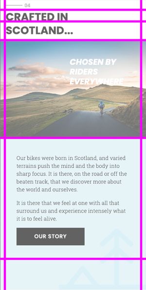
Like them or not they are super useful so I am going to start with a media query for 320px and above. This is actually around about an iPhone 5 size and is the minimum I am going to start supplying the designers intended mobile layout.
I start be defining a grid of columns and rows to place my content. By using a custom property for the heading we can set the row to be the same as the chosen font, this will come in useful when we move to desktop size.
  .grid-section{
        display:grid;
        grid-template-columns: 1rem 1fr 1rem;
        grid-template-rows: 30px var(--italic-header)  60px min-content min-content 100px;
    }
We can then assign row values to the html items to achieve the mobile layout, note the tree background and the text and button are positioned on the same row and overlay each other rather than the tree div containing the text. This is needed so we can achieve the desktop layout.
.chapter {
       grid-row:1;
       grid-column:2;
       align-self:center;
    }
 etc...
Wide open plains.. #
Once we get to around 768px it is time to start implementing the designers vision for desktop. At this point we start using a 4 column grid and then position the image and the blue div with the tree icon so that they overlap each other. Z-index is applied to sit the blue div behind the image. To create the overlap I have 2 fixed with columns ( 1 and 3) and then the other 2 are fractional widths (fr). The blue box is set to cover columns 1 to 4 and the image 3 to the end. We use -1 to set this although you could set it to 5 in this case.
Position the secondary header in the same grid column and rows as the image and then make use of the align and justify self rules that you will no doubt know from using flex.
.h-color-white {
    grid-column:3/-1;
    grid-row:1/4;
    position: relative;
    align-self:center;
    justify-self:center;
    text-align:right;
    font-size: 2.5rem;
    width:75%;
  }

img {
    grid-column:3/-1;
    grid-row:1/4;
    width:100%;
    height:100%;
    object-fit:cover;
}
On the left hand side we need to increase the text size of the heading and position it to sit on the top of the blue box. By using a custom property we can set the row height to be the same as the font size and in this case by using a viewport width value it will scale and position together! So exciting that you can use both a custom property as a value in the grid properties AND use vw units.
.grid-section{
    --italic-header: 3vw;
    display:grid;
    grid-template-columns: 100px 1fr 100px 1fr;
    grid-template-rows: 40px calc(var(--italic-header) - 1px)  1fr 50px;
    padding-top:3rem;
  }

.h-italic {
    font-size:var(--italic-header);
}
The final tweaks #
There is one part of this design that I haven’t actioned, the designer would like the heading to break and the second line be inset from the first. This could be done using spans inside the title - but for me this isn’t ideal, what if the title is controlled by a CMS? I prefer to avoid manipulating titles altogether but if it is essential for the design and the client knows the limitations I would use Javascript at this point to add the spans in and create the visual effect. I created a little function to achieve this which you can find on Codepen.
What have we learned? #
My aim of this tutorial was to try and open up the possibilities of writing progressive clean code AND making your life as a front-end developer less of a war with the browser and/or your design team.
If you are just starting out with CSS Grid I can’t recommend the Firefox Dev Tools enough, it is so useful for seeing how your grid is reacting to content. You should also follow Michelle Barker, Jen Simmons, Rachel Andrew and Andy Bell (creator of every-layout.dev) as they are all great sources of information and tutorials around front-end layout!
“Christ son! Use the right tool for the job.” - my Dad
My dad would always say "use the right tool for the job" through tears as I used his expensive chisels to try and break rocks open to find fossils, sage advice and if the option is there for you to be flexible you might find using grid your perfect tool on your next web build.